Apple has always been known for bold design choices. In 2025, it has introduced something completely different – the Apple Liquid Glass Design in iOS 26 and macOS “Tahoe.” Imagine your phone or laptop looking like it’s made of crystal, with layers that glow, blur, and shift depending on how you hold it. It’s futuristic, it’s beautiful, and it’s already sparking debates online. So, what exactly is Liquid Glass, why is everyone talking about it, and will it actually make your Apple experience better?
What Is Apple Liquid Glass Design?
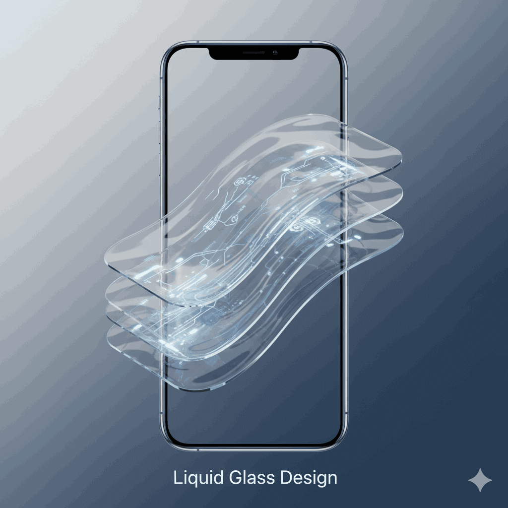
Liquid Glass is Apple new user interface design language. Instead of flat icons or simple colors, everything feels like layers of glass.
- Transparent panels
- Dynamic blur effects
- Subtle reflections that move with light
It’s rolling out across iPhone, iPad, Mac, Apple Watch and even Apple TV. The idea is to give you a seamless, unified and premium look across all devices.
Why Everyone Is Talking About It
- It Looks Futuristic – Screens look alive, like you’re using a next-gen device.
- Consistency Across Devices – The same Liquid Glass look on iPhone, iPad and Mac makes everything feel connected.
- Biggest Redesign in Years – Apple hasn’t gone this bold with design since the flat look of iOS 7.
The Good Side of Liquid Glass
- Beautiful Visuals: Sleek, glossy, futuristic feel.
- Immersive Experience: Widgets, sidebars and menus almost float on screen.
- Premium Identity: Makes even older iPhones look high-end.
- Unified Design: No matter which device you use, the interface feels the same.
The Criticism: Why Some Users Hate It
But the Apple Liquid Glass Design isn’t winning over everyone. On social media, some users are calling it “pretty but impractical.” Here’s why:
- Readability Issues: Transparent backgrounds sometimes make text hard to read.
- Battery Concerns: The extra animations may drain older iPhones faster.
- Performance on Older Devices: Early testers say UI animations feel heavy on iPhone 11 and below.
- Too Much Style, Less Simplicity: Not everyone likes flashy designs.
Apple’s Response
Apple has already made small tweaks in beta updates –
- Reduced transparency in some menus to improve contrast.
- Polished lock screen animations.
- Improved icons and toggles for better usability.
Many expect Apple to add a “transparency control” option so users can adjust how strong the Liquid Glass effect feels.
Should You Be Excited?
If you love aesthetic, futuristic design, the Apple Liquid Glass Design will blow you away. It makes your device feel brand new. But if you’re someone who values simplicity, speed, and battery life, you might find it unnecessary. The good news? Apple usually balances things over time. By the time iOS 26 officially rolls out, Liquid Glass could strike the perfect middle ground between beauty and practicality.
The Apple Liquid Glass Design is bold, eye-catching, and definitely trending. Whether it becomes a classic like iOS 7’s flat design or fades as a stylish experiment depends on how Apple refines it in the coming months. One thing’s certain: Apple has once again started a global conversation and that means people will keep clicking, sharing, and debating Liquid Glass until the final release.
Team By Also Author – Flame Tadka / flametadka.com